

Halidrams Rebrand
Why
Haldiram's, established in 1937 in Bikaner, India, by the Agarwal family, is known for its delectable Indian snacks and sweets. Bolstering this commitment to growth, Pankaj Aggarwal, the managing director of Haldiram’s has emphasized the brand’s desire to expand globally. To address this challenge effectively, we recommended that Haldiram undertake a strategic initiative by launching a new sub-brand to the USA, primarily targeting American and Indian-American families.
This endeavor aims to rejuvenate and modernize their brand identity and product marketing approach, ensuring alignment with the ever-changing global market landscape.
Concept
Tradition that is Authentic Innovative and Elevated
This endeavor aims to rejuvenate and modernize their brand identity and product marketing approach, ensuring alignment with the ever-changing global market landscape.


Logo
The goal was to streamline and modernize the logo for easy readability by both native and foreign audiences, especially since the brand's name is in Hindi and may pose pronunciation challenges.
Brand Identity
Let’s Preserve their Roots
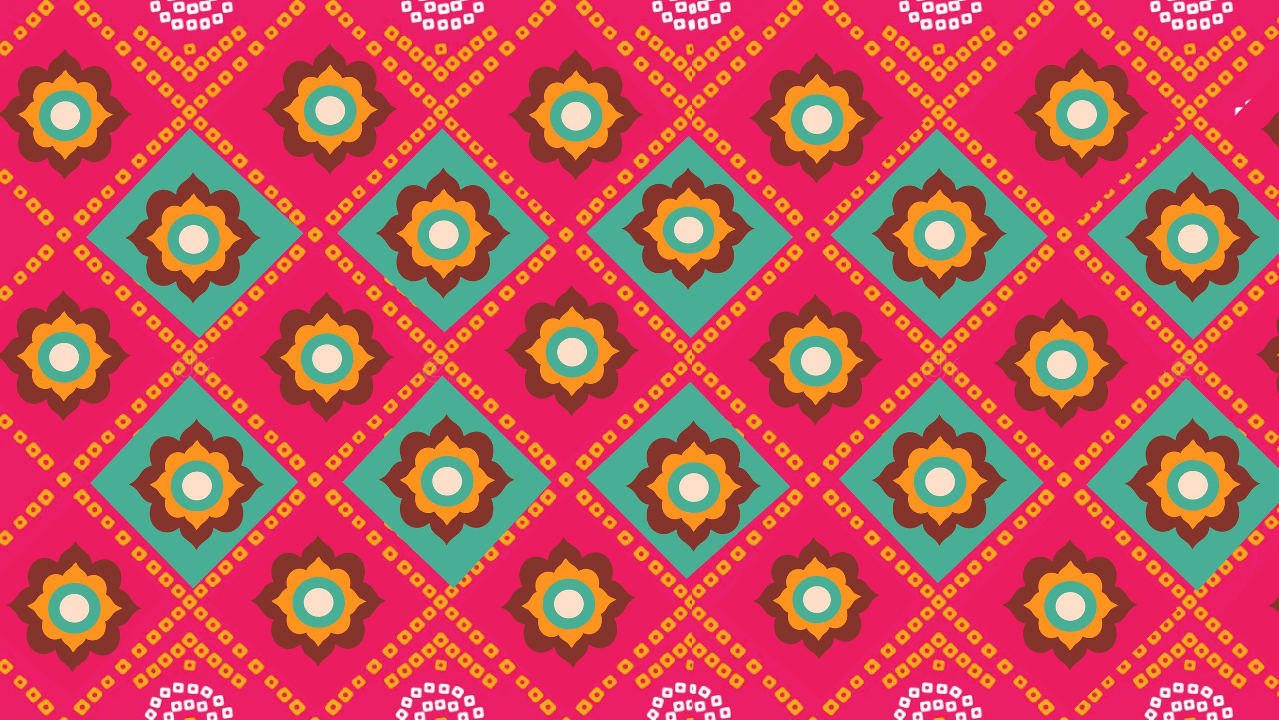
Ilustrations - In the realm of illustrations, a deliberate design choice was made, to safeguard the rich tapestry of Indian culture and heritage intrinsic to the Haldiram's identity.
Harking back to Haldiram's forefathers, who often sported vibrant turbans or 'pagdis' adorned with beautiful, colorful fabrics, one such notable fabric was the 'bandhni.’ ( known for it’s intricate white block prints and was closely associated with Rajasthani attire and culture.) The llustrations drew upon these elements, including the distinctive use of white dots. This design aimed to pay homage to tradition while infusing a modern perspective.
Color - Likewise, the color palette found its inspiration in the lively array of vibrant embroideries and textiles.


Packaging Design Concept
It was time to reimagine the existing Haldiram snacks in a manner that piqued the curiosity among the target audience and made them irresistibly appealing.
Typography - Typography served a dual purpose in the packaging design: simplifying the product's ingredients while incorporating catchy words like "crunchy," "addictive," and "aromatic" to pique the audience's curiosity playfully, encouraging them to engage their senses and wonder about the product.


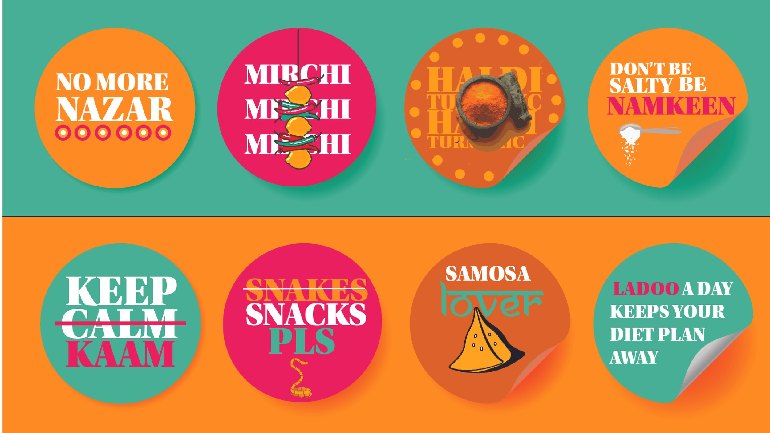
Masti and Masala
A campaign that celebrates the meaning behind familiar Indian words found in everyday dishes. By revealing what words like Masala, Namkeen, or Mirchi truly mean, the campaign invites audiences to connect more deeply with Indian culture through food and language..To spark curiosity and appreciation for Indian culture by teaching simple Hindi words in a relatable, flavorful way.


